


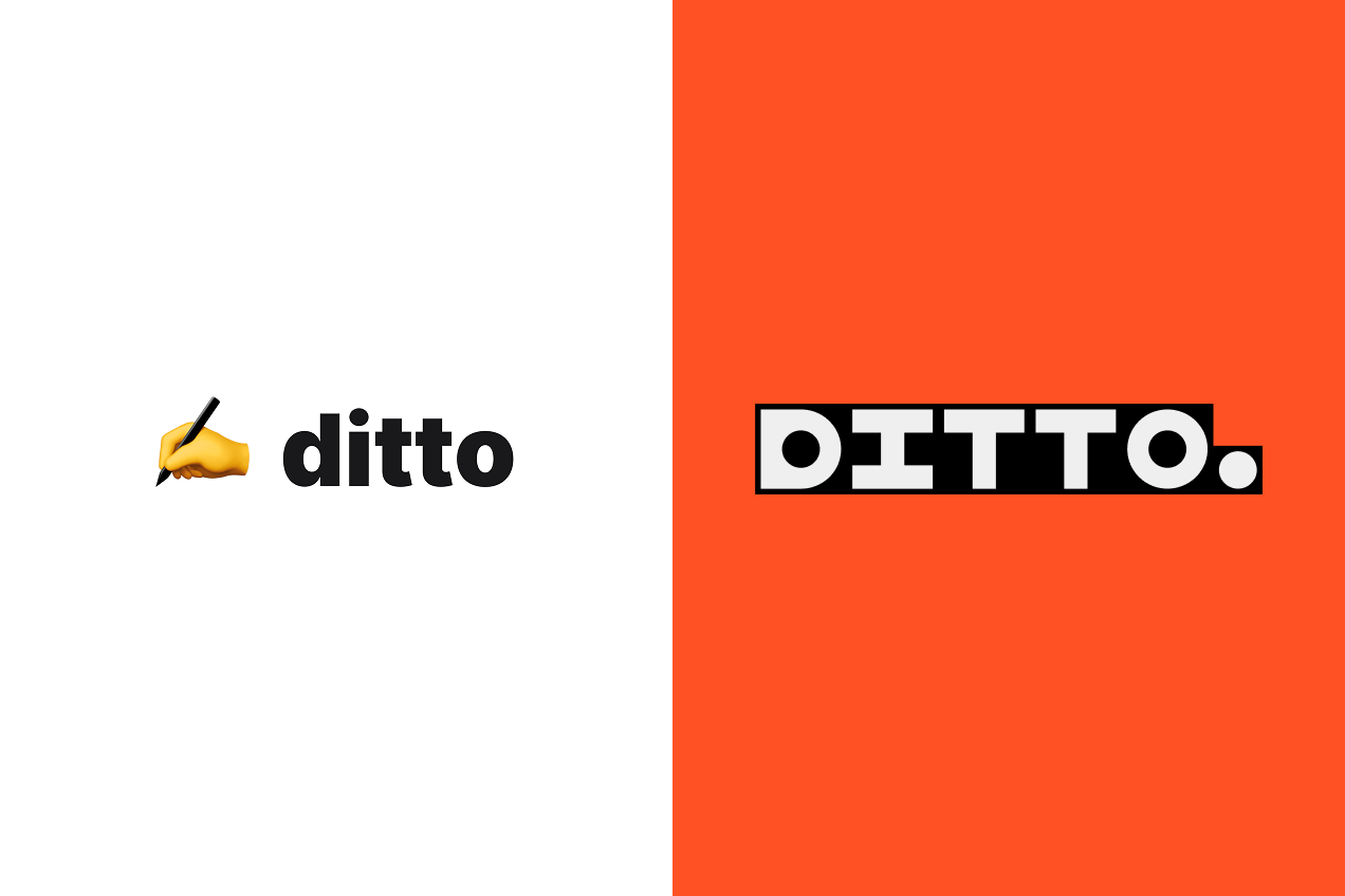
In case you missed it, Ditto just went through a massive rebuild, and nothing was off limits. We rebuilt the product, overhauled the brand, and launched a shiny new website to accompany it all.
Our previous brand was a reflection of a very early startup—just enough to get us started. But we were growing, as a product and a company, and now was our chance to go really explore our brand platform: Our values, our identity, and how we express our brand to the world. It was our opportunity to signal just how invested we are in the problems we're solving, and bring others along in our conviction that the words we use in our products are the single most powerful tool we have to deliver experiences that convert, educate, and personalize.
This project was personal, and that made it challenging (shoutout to Fuzzco for battling through with us!)—we cared so deeply about every decision and what message it sent.
.png)
Here are some things we knew from the start
We wanted to be opinionated, in both messaging and brand.
- Ditto is creating a new product category, and solving a problem that’s been ignored for far too long. We want to lead the way, with a strong opinion.
- We were adamant: Everyone touches text, so everyone cares about text (in their own way). We wanted to put text at the forefront, and give it the attention it deserved.
- Being opinionated to us meant being direct — avoiding jargon, distraction, or fluff. It did not mean “flashy” or loud, just for the sake of it.
We wanted our brand to capture and communicate the core product themes of Ditto.
- We believe text is the most important part of the user’s experience. Without words, it’s all decoration.
- We believe in treating text as building blocks, meant to be systemized and iterated on over time.
- We believe in reuse, repeatability, and consistency as a core part of managing product copy and building an effective content system.
- We knew that words had to be at the center of Ditto’s brand — because words are what matter most.
And lastly, we wanted to treat this whole project like our love letter to product copy.
- We wanted our brand to connect to the people who “get it” — that words are a product’s superpower.
- “Words people” had to feel like they’re in the in-group. This is not specific to a role or job title: We just wanted to connect with the people out there prioritizing product copy without having to be told to do so.
More than anything, we knew this identity had to reflect our values and principles strongly—which meant we had to uncover and deeply understand them first.
From strategy to identity
This rebrand process involved a complete rebuild of every layer of our identity: The brand strategy (vision, mission), our brand identity (name, character attributes, values), and our brand expression (logo, colours, typography, etc). Each informed and illuminated the next, and we couldn’t confidently have one without the foundation before it.
First: Brand Strategy
The brand strategy came first: It forced us to identify, articulate, and sharpen our vision. Who are we (and who aren’t we)? Why do we exist? Why does it matter? How do we finally give product copy the credit it deserves?
By using our company positioning and core product tenets, we created Ditto’s core vision: Our clearest statement of purpose, and the rallying call for our team and our customers. We used that vision as the foundation for everything to come.
That big, prominent “love letter to product copy” that you see on our new homepage? That was a direct result of figuring out our brand strategy.
Second: Brand Identity
Once the strategy was defined, it was time to define the brand identity. How do we take our vision, and create the visual attributes to communicate it? How do we actually capture our character, our personality?
This is where important opinions we’d been holding from the beginning actually came to life: We believe text is the building blocks of product, and now we had to visually represent that.
.png)
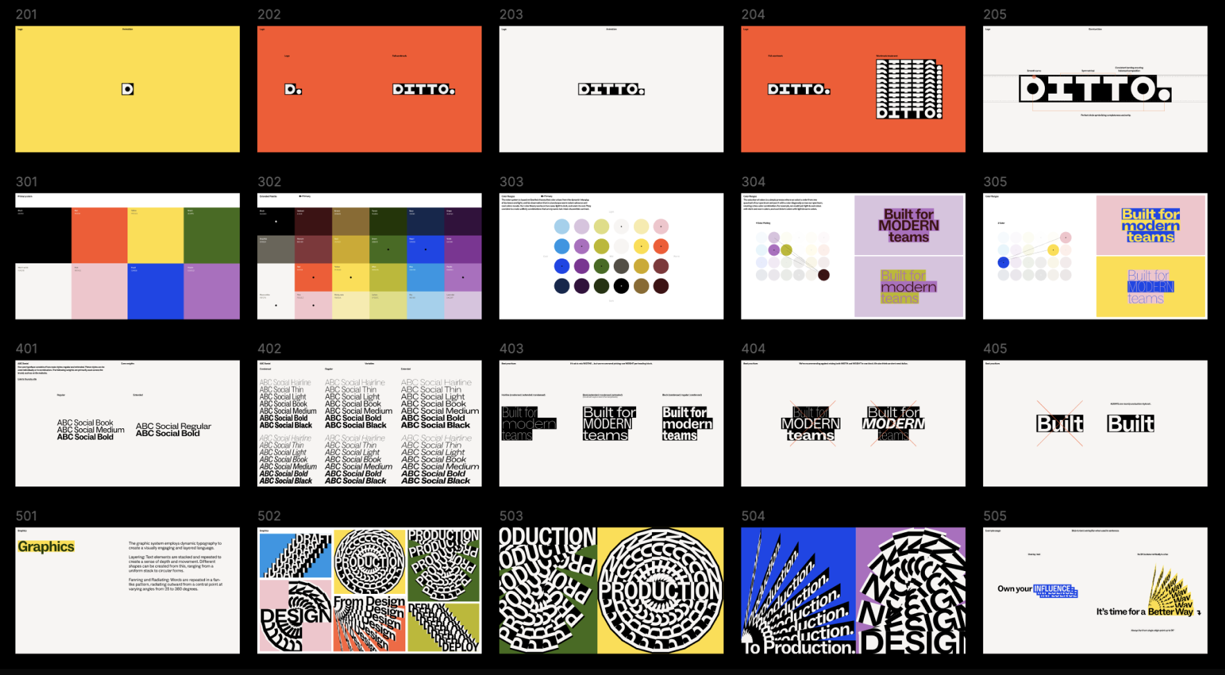
Third: Brand Expression
The last piece of the process was defining Ditto’s brand expression — how all the pieces of our brand strategy and identity actually exist in the wild. Although this is what you all get to see in practice, this was the “easiest” part of the process — with a defined strategy and identity, these felt like natural pieces to fall into place.
To build out our brand expression, we created:
- The new Ditto logo and all alternative marks
- Colours and typography
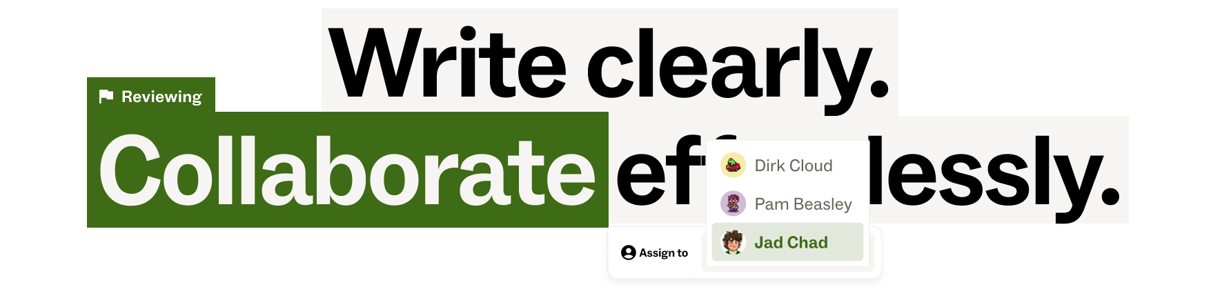
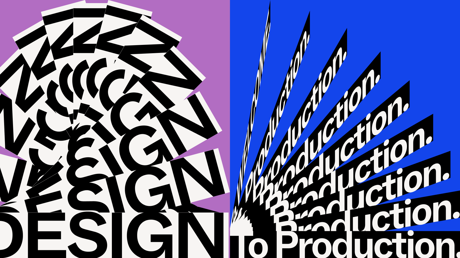
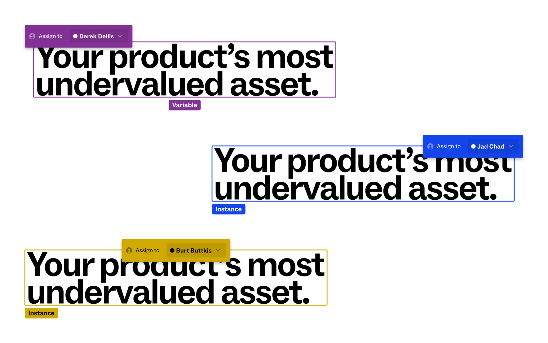
- Visual themes: Repetition, sharp square visuals, building blocks, interactivity
- Motion and interactivity, bringing delight and emphasis to the words on the screen
You can check out a more complete portfolio of Ditto's new brand expression from our brand partner, Fuzzco.

Part of this process was also bringing the identity and expression into the product UI itself. Our Head of Design has dedicated a full article just to this process, and how brand evolution impacts our entire design system.

After many months, countless workshops, and seemingly endless revisions, we are so excited to bring the new Ditto to life. Ditto’s new brand identity, alongside the recent release of Ditto 2.0, feels like the beginning of the next chapter, both for Ditto and for product copy. We’re even more sure now than ever that product copy is a crucial component of the product experience, and with the right tools, product teams can tap into this hidden powerhouse and make every word count.
.png)
.png)